
Bleiker’s had 25 years of craft, a genuine product and a family smokehouse behind it. But the smoked salmon aisle sat between commoditised own-label and stuffy heritage premium, neither relevant to a generation eating salmon on weekday lunches and weekend bagels.
Bleiker’s asked KISS to refresh the identity and portfolio, define a clear proposition and build a position that spoke to a younger, health-conscious, food-loving generation, while keeping the craft and Yorkshire character at its core. The brand had to win shelf space in the major supermarkets, stand out and bring a new generation into the aisle.

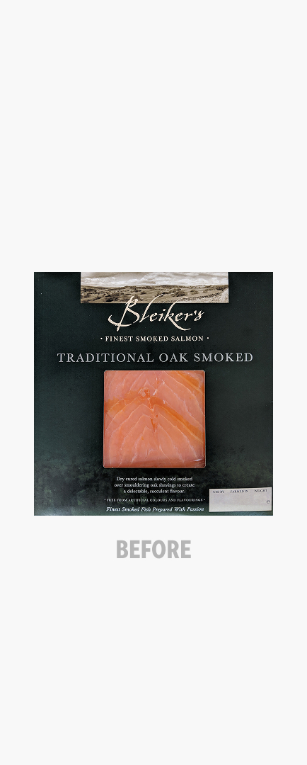
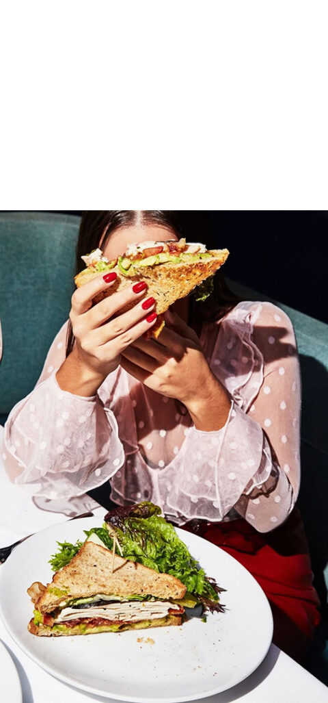
The smoked salmon aisle had two settings: mass own-label with no character, or traditional premium heavy with dark seascapes and occasion cues. Neither spoke to how millennials were actually eating salmon, casually, daily, as a flavour-forward ingredient that turned an ordinary meal into something worth sharing.
Bleiker’s had something neither group could claim: the smokehouse itself. Not the provenance, not the occasion – the process. What happens when fish meets heat, craft and 25 years of Yorkshire know-how. That was the thing to build a brand around.
The soul became Smokecraft. The Home of Smokecraft. A position built on process and passion, ownable only by a family business that had spent a quarter of a century perfecting it. No own-label could claim it. No heritage premium brand had the craft to back it up. Bleiker’s had both.
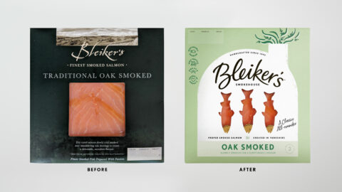
The smokehouse shaped the positioning, then it shaped the design.
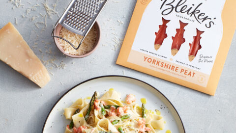
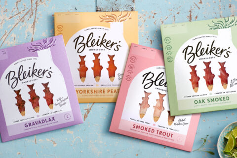
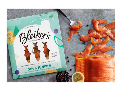
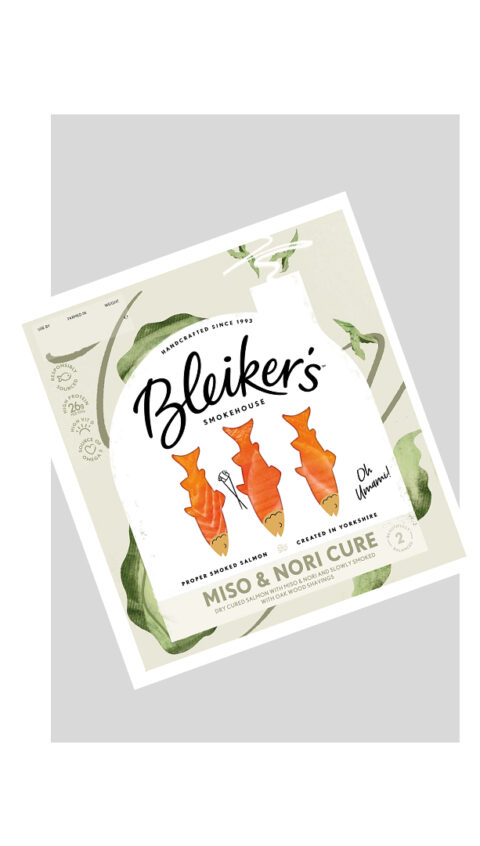
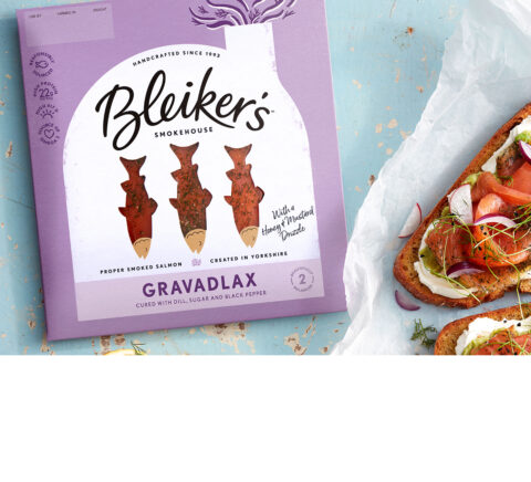
Its form became the packaging architecture, a bold, consistent structure that frames the fish inside and breaks the square format standard across the category. The window invites you straight into the process: fish in the smokehouse, doing what Bleiker’s has always done. Craft made visible on shelf.
The logotype was hand-drawn for an expressive Yorkshire spirit, recrafting familiar letterforms from the old design so loyal customers recognised it instantly. Smiling fish brought humour to an over-serious category and became a device across the seasonal editions.
Colour carried flavour. The smokehouse stays white across every pack for freshness, contrast and authority, while everything around it shifts by variant, the background guided by flavour to build taste anticipation before the pack is even picked up.
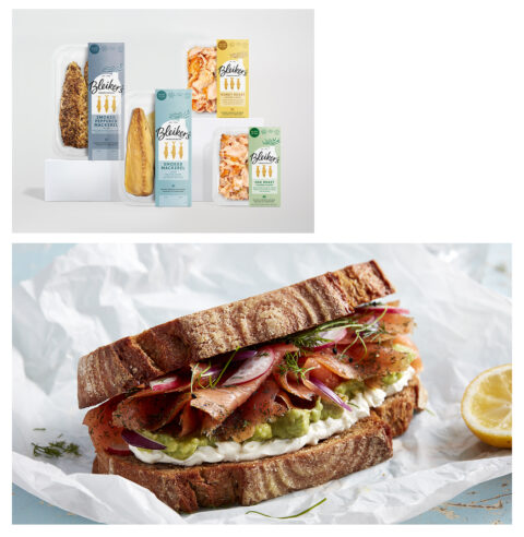
The architecture scales across the whole portfolio. A tall side-wallet format premiumises the flakes and mackerel packs, keeping the smokehouse front and centre. With 12 core products and a pipeline of new flavours, the system was built to grow – every new variant slots into the same architecture, instantly Bleiker’s.